The font you use does matter. For many companies, offering the right font will incite feelings in a lot of people.
Serif and sans serif are two examples. Serif involves a more delicate stroke and flourish that is much smaller. Sans serif is much cleaner and simpler. One of these is bolder, while the other one stands out less.
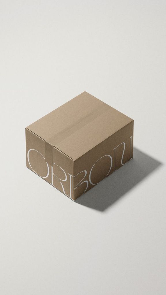
This applies to other fonts too. cursive fonts for instance, signify excitement and importance. Those that are bolder may bring customer attention in. Some fonts as well are perfect for the minimalists out there.
Packaging benefits from a font that will show off the trust, luxury, and urgency. Sans-serif does that a whole lot more, if we’re going by example.
You got to Be Legible
Knowing what makes customers tick with the psychology of fonts is important, but before you settle on a design, you need to make sure that it stands out.
Being legible is just as important. After all, you don’t want a customer getting your item, and then being upset because they cannot read it. Designing it to fit on kraft paper, films, or foil stamping is important, and being eligible offers a unique series of abilities for one to print, in its own sort of way.
Packaging Trends for Fonts
Fonts have their own trends that are worth looking at.
Making them big and bold is one of the most common. Most brands will use this because when it’s big and bold, it can be seen.
Some fonts as well will use lowercase letters, so you want to consider a lowercase-friendly font that won’t look bad. So the cursive might not work if you have a lot of lowercase.
There’s also nostalgic fonts, which use a nostalgic sort of look to them, evoking feelings of excitement, and the good old days as well.
Typography for Brand Identity
That isn’t to say that you have to follow the trends all the time. Some companies have started to put together different typography that works for brand identity.
One example is glossier. Their packaging font is simple, but offers different, unique colors that stand out. Just looking at their package will tell you many things, including the amazing features that it has.
Another one is Apple. When you get an iPhone for instance, you get a package with a great item inside that really stands out. Again, you want to look at how you can make your packaging simple, sleek, but also have it turn heads.
Then there is Oatly, oat milk. Such big, bold fonts with black and white against a colored backdrop stand out. The font is very bright and blocky, but also is easy for you to read. They use a mixture of fonts between the original logo, any sort of names for the item, and also information about said milk.
Again, with all of these, there’s a brand identity that comes with this, standing out and being effective.
It’s On Shipping Too

Shipping supplies benefit from typography. If you have an item that needs to be handled carefully or is fragile, making sure that it’s easy to read and clear as day is not just a suggestion, it’s a necessity. If your brand doesn’t have that already, then you’ll want to look at the packaging for these items as well.
Typography works for packaging effectiveness, and it can, as a result, help you with bolstering the packaging needs that you have, making it not only effective for customers here and now, but also those in the future that purchase such products as well.
